Role: Creative Director / Designer
Scope: Campaign concept, art direction, design
The Problem
Cedar City, Utah has a branding problem most cities would love to have: too much good stuff. It's a jumping-off point for red rock adventure and national parks, and it's also home to the Utah Shakespeare Festival, a world-class theater draw. Most tourism marketing picks one identity and runs with it. That approach was leaving half of what makes Cedar City worth visiting on the table, and half the potential visitors along with it.

The Process
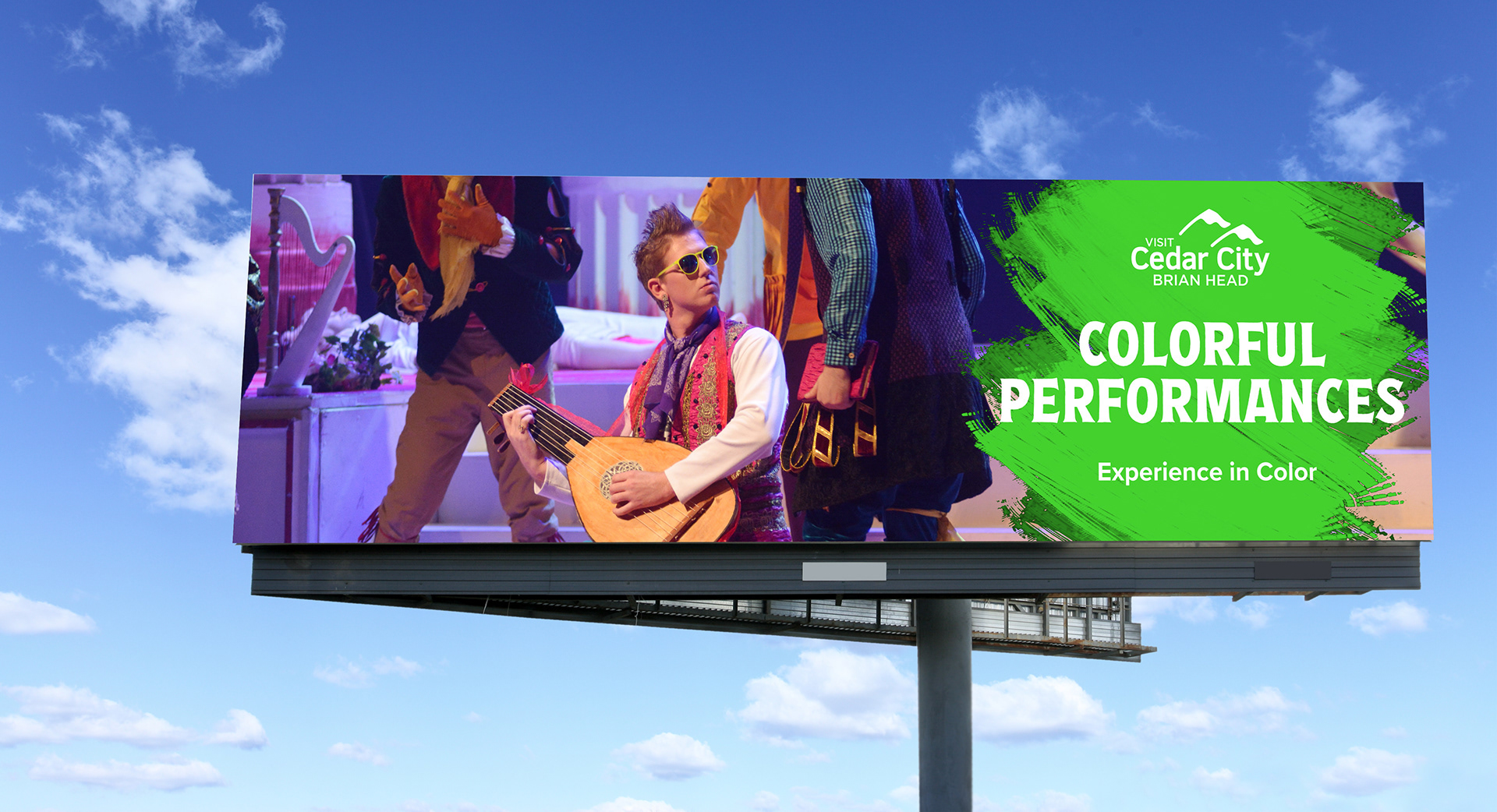
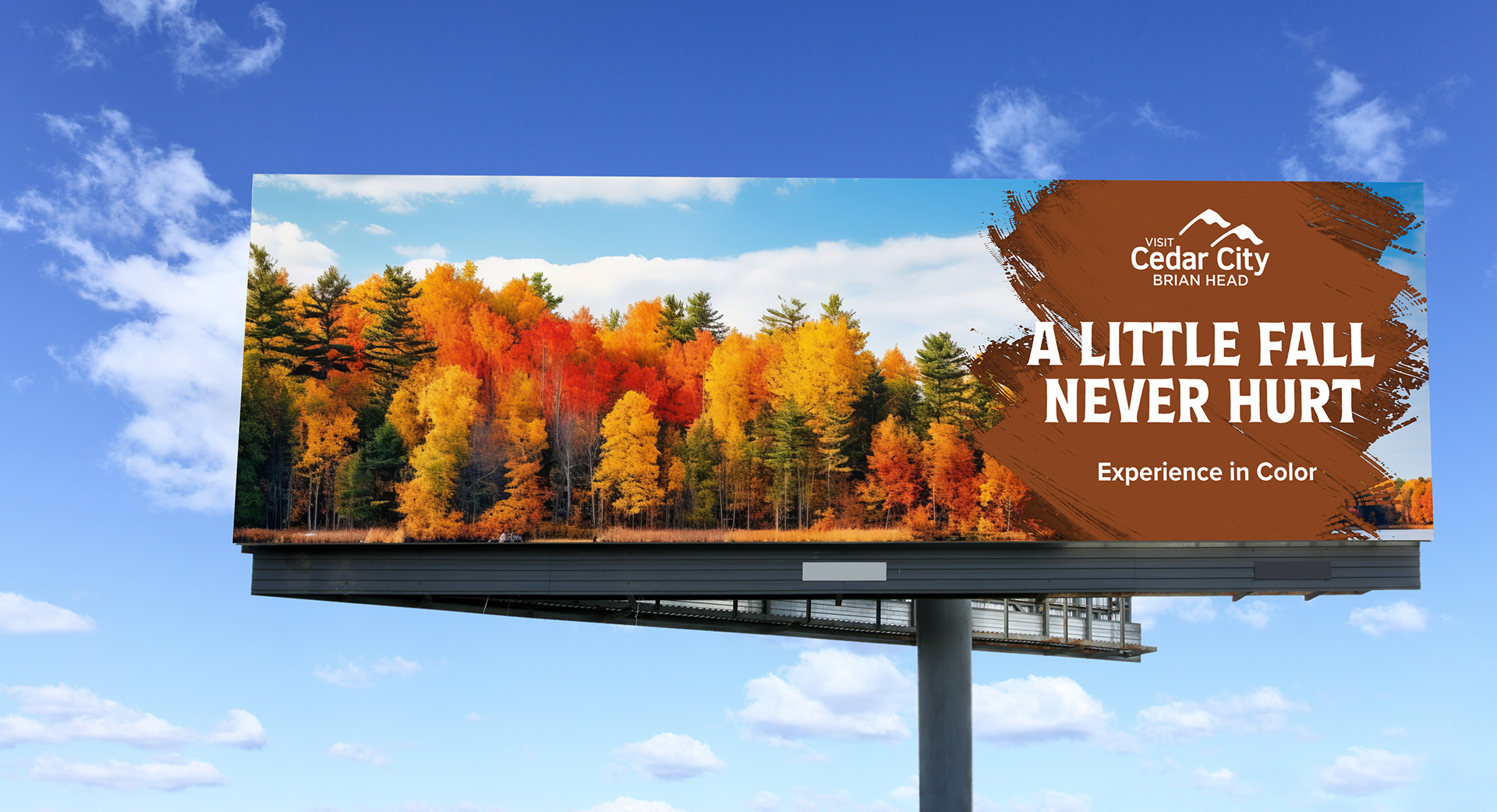
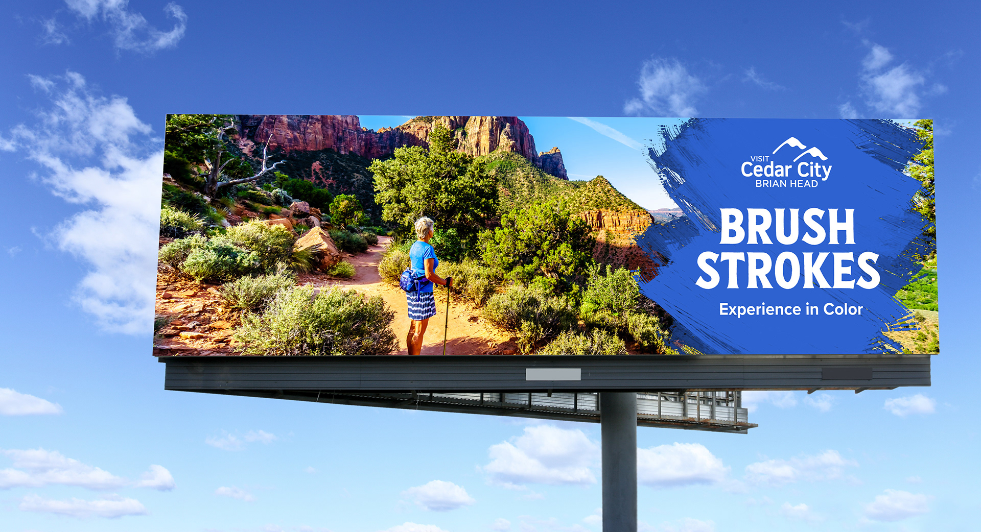
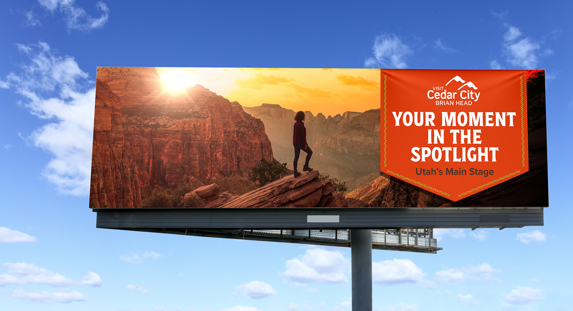
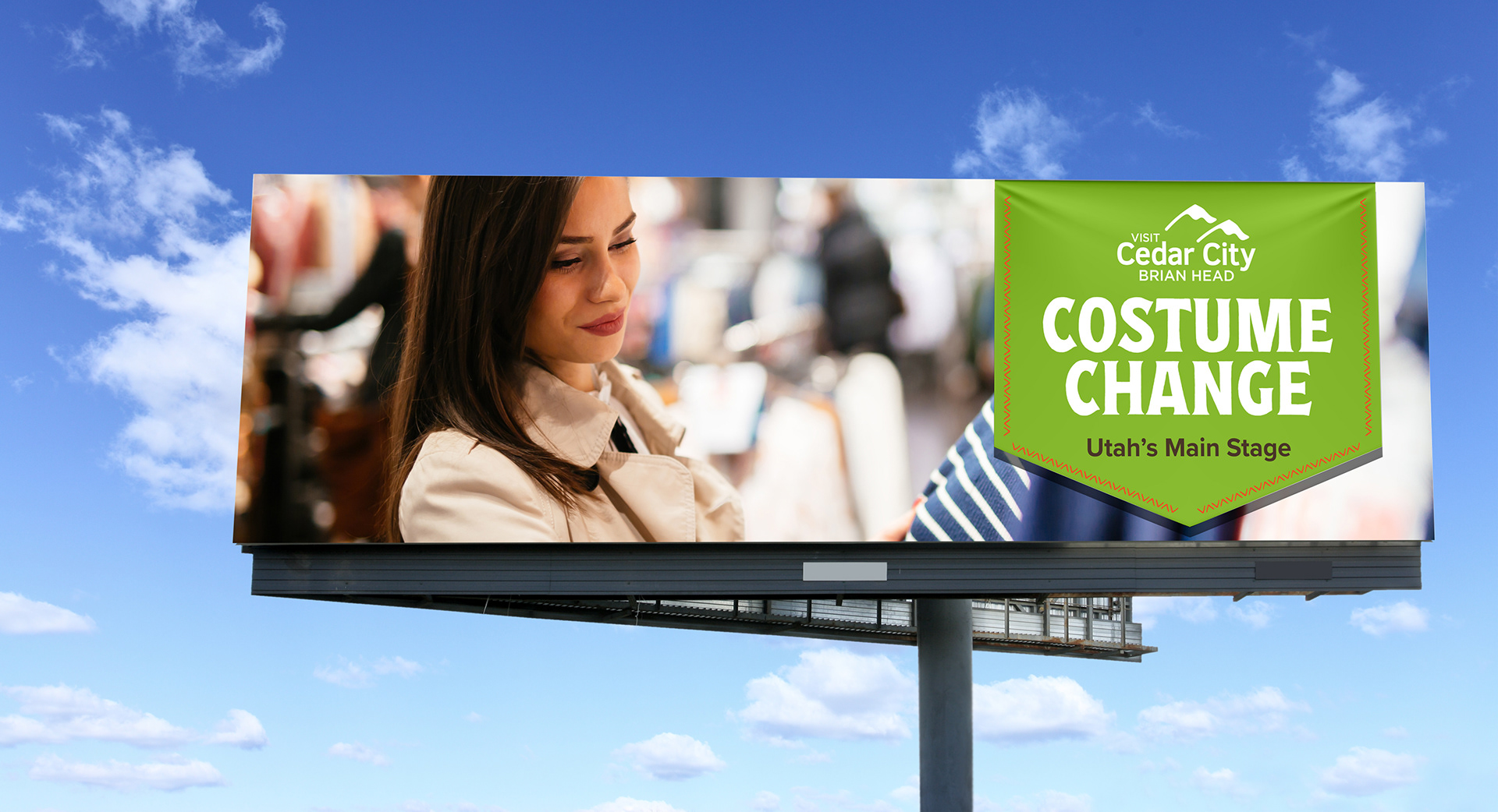
Rather than choosing a lane, the campaign was built around the tension itself. Every billboard was designed to hold both sides of Cedar City in the same frame, rugged outdoor adventure and world-class Shakespeare, so a single piece of outdoor advertising could speak to hikers and theatergoers at the same time, or better yet, make each audience curious about the side of the city they weren't expecting.
The Solution
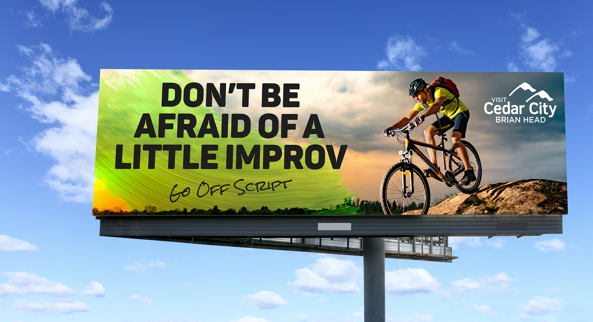
A set of billboards built on juxtaposition instead of clutter. No stacked headlines, no phone number in 40 places, no competing for attention with itself. Just one clear contrast per board, designed to actually hold up at 75 miles an hour. In a stretch of highway where most boards are shouting the same thing, these were built to make people look twice for the right reason.



The Outcome
This was a concept-driven piece built to prove that Cedar City's dual identity could be an asset instead of a branding headache, not just showcase one polished version of the city. It's part of a broader body of tourism and destination work.