An all-electric off-roader deserved a launch page that hit as hard as the truck.
The ask
Vanderhall had a new EV that looks like nothing else on the trail, and a landing page that didn't do it justice. It had some graphics explaining what makes it run but the page itself didn't have any personality to match the brand or give the customer any hope this thing will provide the adventure they are looking for. The landing page needed a story and some excitement to make the brand actually give a promise. The Brawley needed a page that could build hype and turn it into reservations.
The approach
Lead with the vehicle, then earn the scroll.
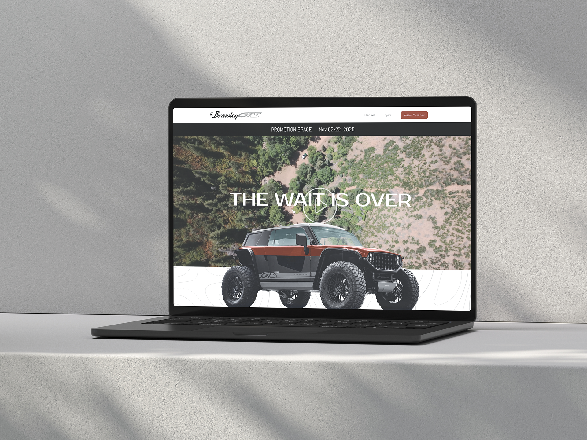
- Hero: "The Wait Is Over," full-bleed aerial trail footage, and the truck front and center with a live color picker. You see it, then you spec it.
- Story in chapters: Power, cabin, footprint, lighting. Each section opens with a short, punchy headline and backs it up with a single hero visual.
- Specs that show, not tell: Interior dimensions sit right on the cabin photo. Exterior measurements wrap the truck on a blueprint-style render. The numbers stop being a table and become part of the story.
- A system that says "off-road": Topo-line textures, dark trail photography, and one rust-red accent reserved for the CTA.
- Friction-free conversion: "Reserve" appears four times, at every natural decision point. The full spec sheet sits at the bottom for the people who want everything.
My role
Creative direction, UX,
The result
Reservations shot up 300%
